
Nowadays, bootstrap is mostly used for creating responsive websites. Now, responsive means, when the size of the window or screen changes the layout of the website still looks Good. To incorporate a bootstrap into your application there are two things that we can do.
We can either implement the bootstrap into our code or either download a sample project. To start we’ll take a look at the code we’ve been working on. In my case, I’m working on the sublime text here. So, I’ll import the framework.
To import bootstrap, we can either download it and link it locally to our code or just link it from the internet. We’ll for instance link it from the internet and it’s going to look a lot how we link to CSS here. So, going to the bootstrap website we can just copy and paste the link into our code and it’s done.
Bootstrap is one of the free front end web development framework which is fast and easy to use. The Bootstrap includes HTML and CSS based design templates for typography, forms, buttons, tables, navigation, etc. It also includes some javascript plugins. Bootstrap was developed by two of the engineers that already worked for Twitter. Its first version was released in 2014. Since then, it’s the number 1 project on GitHub.
Bootstrap Templates
These are actually built-in page layouts for you that are already created. You just need to choose the most appropriate one that best suits your business style. The bootstrap 4 themes are set of HTML, CSS, and JavaScript packages that offer you flexible styling when needed. Based on your business requirement you can choose amazing bootstrap premium templates at the best price that will help you save time and money.
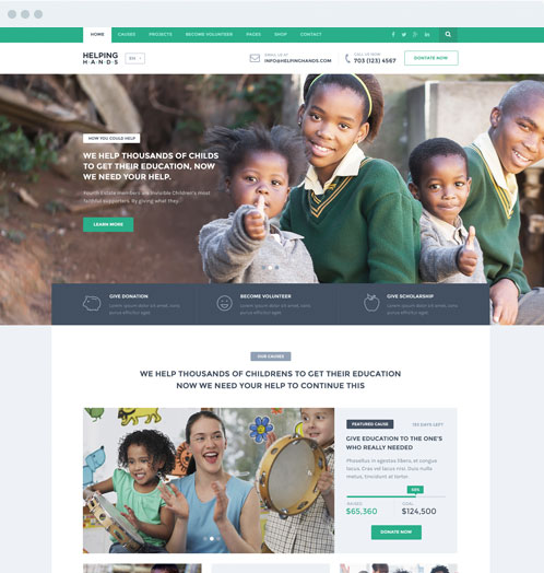
Medika Bootstrap Health Website Theme

Medika is a high-quality Bootstrap 5 template specifically designed for Health and Medical websites. It follows all the major web design trends and comes with a freshly designed homepage, services pages, schedule page, blog pages, contact page, and book an appointment page. It works natively both on desktop as well as mobile devices, making your website user-friendly and enhancing user experience.
Insurance Press

Insurance Press is a multi-purpose Bootstrap 5 Website Template. It allows you to build a fully-responsive website for general insurance, car insurance, health insurance, and others quickly and effectively. The template has an intuitive interface that conveys the content to users in the easiest manner possible.
Joytun Free Bootstrap HTML & SaSS Template

Joytun is a free and creative medical HTML template. It is suitable for any dental, fitness, yoga, clinics, hospital, doctor, gym, fitness, supplements, and nutrition website. This template works smoothly on different browsers and screen sizes. Its well-organized code makes it easy to customize and update the content.
Why Should We Use Bootstrap?
Bootstrap offers several advantages. The most important of these are:
- Easy to use as and fast as compared to other coding methods.
- It has several responsive features and is compatible with all the latest web browsers.
How to Get a Bootstrap?
We can download bootstrap from www.getboostrap.com. The latest version that is available for download is Version 4.5.2. To download click on the download button and select your preferred option.
CDN way of Installing Bootstrap
CDN stands for a content delivery network. All that must be done is to copy the content or code and return to your coding tool editor.
Let’s start the installation step by step.
- Let suppose if I’m using a sublime text editor. I’ll initially create an HTML file with the name demo and then I will write the basic HTML body code for it.
- To install this web development framework we need to paste whatever we’ve copied from the bootstrap official website over the sublime text editor.
There are other ways to download the framework. We can use Bower, npm, and something like a composer.
CDN downloads all the features like forms, buttons, image carousel models, and something similar. If all these features are not required then we could use the customized option on the website to easily select and download only those components of bootstrap that we require.
The customize button takes it to the following URL. www.getbootstrap.com/customize. If your bootstrap installation is already customized thus thereafter files can be imported using the command config.jason to this page manually.
If the customization is done for the first time then uncheck all those components that aren’t necessary. To illustrate I would show you what features I’d be using let’s say the dropdown.
I can select features based on the requirements that our project needs. We have to remove all those that won’t be required in our project. Then click on the compile and download button. The button will initiate the download of the customized version of bootstrap.
The download will also include a file called config.json which can be used later to download the similar copies of bootstrap from the website.
Bootstrap Classes that we can use
First the bootstrap app grid system
The grid system divides each row of a webpage into twelve columns. The customization of columns will as per the necessities of the user.
For Example: Add a div element to it then add a bootstrap class either a container or a container fluid. To illustrate the difference between the two add the container class first and save the file as bs_demo.html.
The style attribute could have been an aspect of customization. The style tag for the div element.
For instance, create a border of say 1px, solid red. Let’s go to the browser and open the file that we’ve just created. Now the output can be seen in the screenshot. The file has been opened the file can be seen on the screen this isn’t entirely accurate thus I’ll add content in the div which is this is a div with a class container and save the file.
Now if we’ll run the code then we’ll see that since we use the container class for the div element. It leaves spaces on both sides of the container. Now if we head back to the code then change the class from container to container hyphen fluid and then refresh the browser you’ll find that the container hyphen fluid occupies the entire width of the page.
Let us use another container that is really alike. Using this we can get rid of the static text that I used for as mentioned to divide the browser into several columns we can use different classes.
So, once again include div element with a class defined by the syntax for columns. Row followed by another div technically we can as many divs as you want to depend on the number of columns required. With class defined by the syntax col hyphen the size of the column. Here xs is used for extra small and sm for small. These are for medium desktop and larger desktop. It all depends on the requirements you need.
As we know bootstrap divides the row into twelve columns. We can use some of the columns together for
Bootstrap or Either CSS?
The most important reason why people prefer Bootstrap to CSS is that it saves a lot of time. Which respectively saves a lot of money. The reason it saves a lot of time is that a lot of the CSS mockups that bootstrap provides. Enable me to not worry about all the CSS out there. It means rather than creating a media query and responsive designs for my CSS. It’s ready to go Bootstrap.
So what we’ve concluded so far is that we have a flexible environment here to create multi-platform compatibility websites with comfort. The website would be user-friendly with faster navigation.